Overview
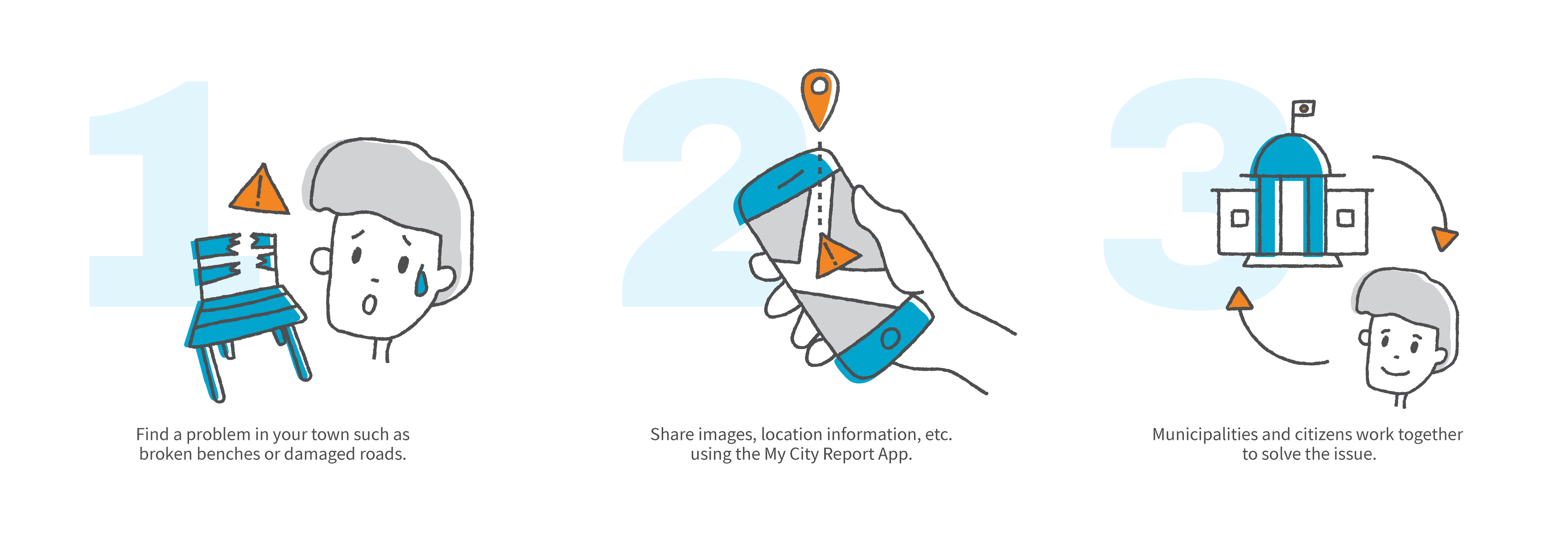
My City Report is a mobile app that enables effective collaboration between citizens and governments to solve issues like damaged roads, broken streetlamps, etc. When spotting issues that need to be fixed citizens can create a quick report with their phone and get updates about the fixing process.
My Role
Quantitative user research and feedback analysis · Low/High fidelity wireframes · Prototyping · Illustration and icon design · Design system / style guide · Usability testing · A/B testing
Identifying goals and issues
The app was launched as a trial project before I joined the company, without much consideration to UI and UX but quickly developed a core user base. To further increase the number of active users and to attract more municipalities in Japan to join My City Report I conducted a survey among the users. With the survey’s results, we were able to get a better understanding of user behavior and set goals for the future of the application.
The main goals are to ...
● Increase the number of reports created by different users
● Grow the number of registered users
● Increase activity in municipalities that had low activities before
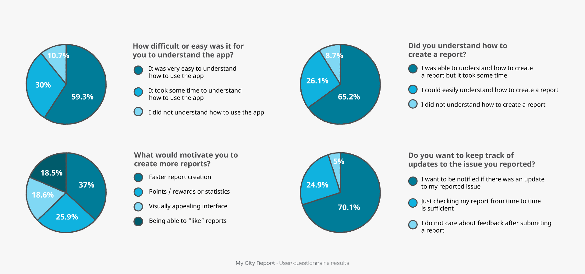
User interview results
From the survey, we learned about the following main issues
● When starting the app, the users didn’t clearly understand how to navigate the app and how to start creating a report.
● They had difficulties following updates to the reports they made / they feel there was not enough feedback
● Creating a report was hard to understand or/and it took too long for the users
● Most users would be more motivated if there was some kind of reward system or at least a leaderboard or some general statistics about the reports they made
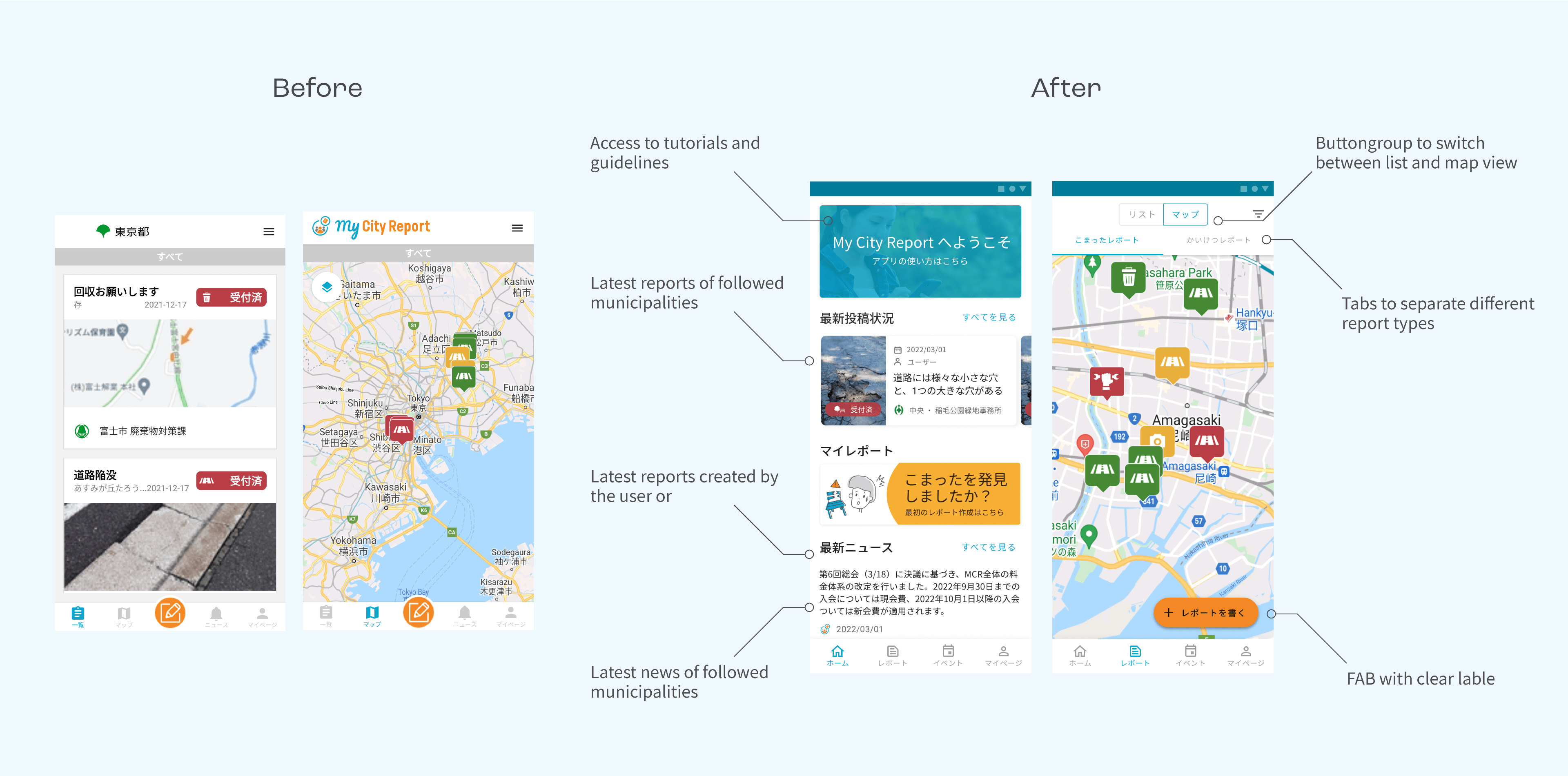
Changing the navigation
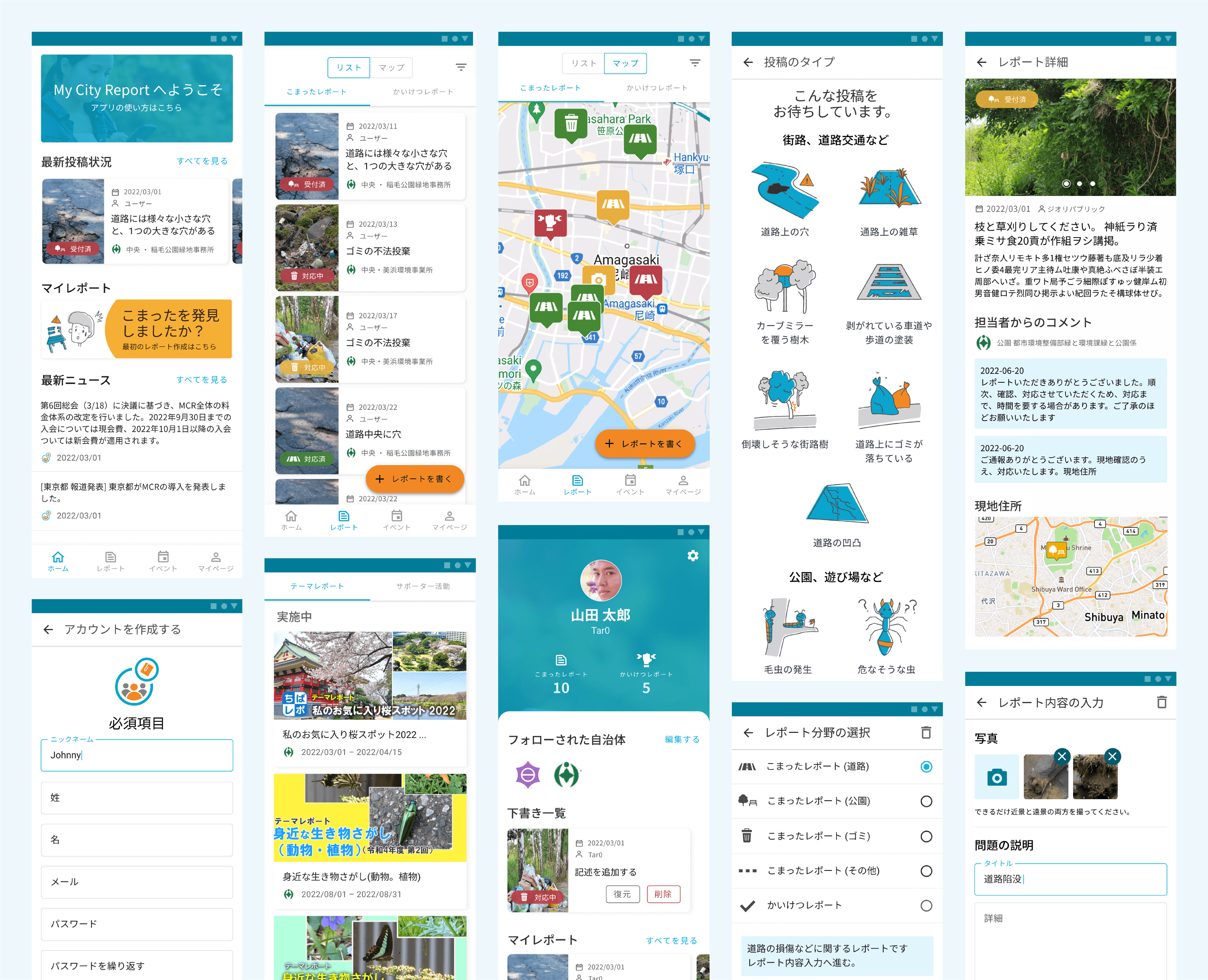
In the old version of the app, the first screen users would see was a list of the latest reports, which was not clearly labeled as such. The separation of the report list view and map view into two different screens that are accessible from the bottom navigation caused further confusion because users did not understand that they are seeing the same information in different views.
To better guide the users it was decided to add a home screen to the app. From the home screen users can see a list of the latest reports, their own reports as well as news, and access to a tutorial page. Furthermore, the list view and map view were combined into one screen called reports, where users can switch between map and list view.
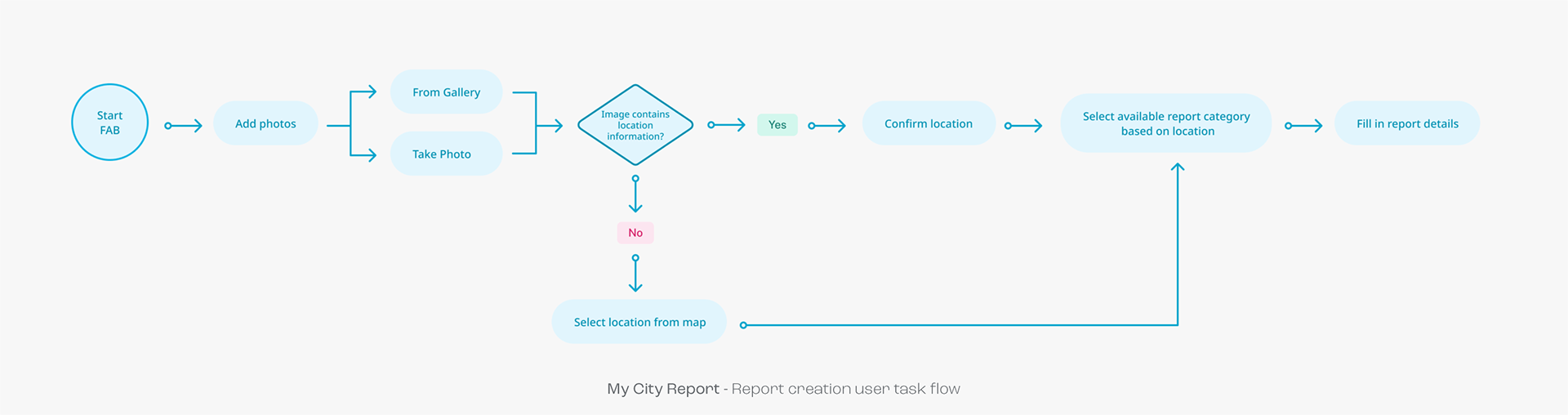
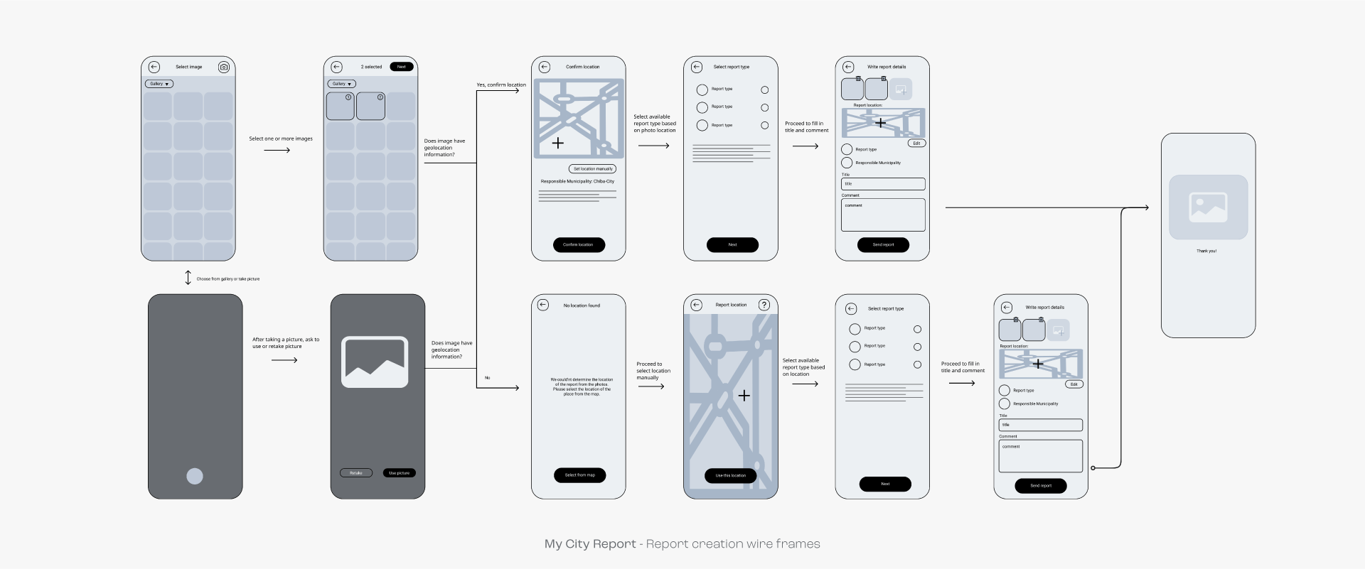
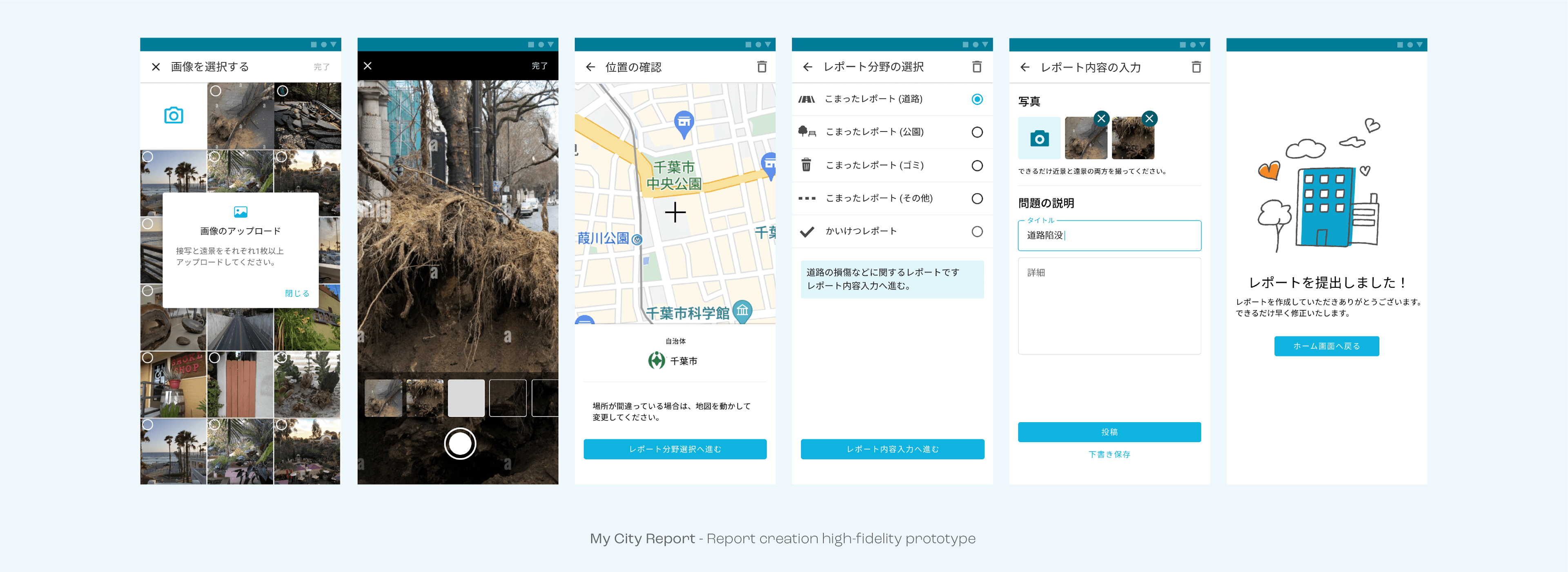
Optimizing report creation
Reporting found issues is the main task users have to do with the app, so it is important that this process is smooth and pleasant. We reduced the steps the user has to take to complete the task, for example by using geolocation data from images instead of letting the user choose the location of the issue by themselves.
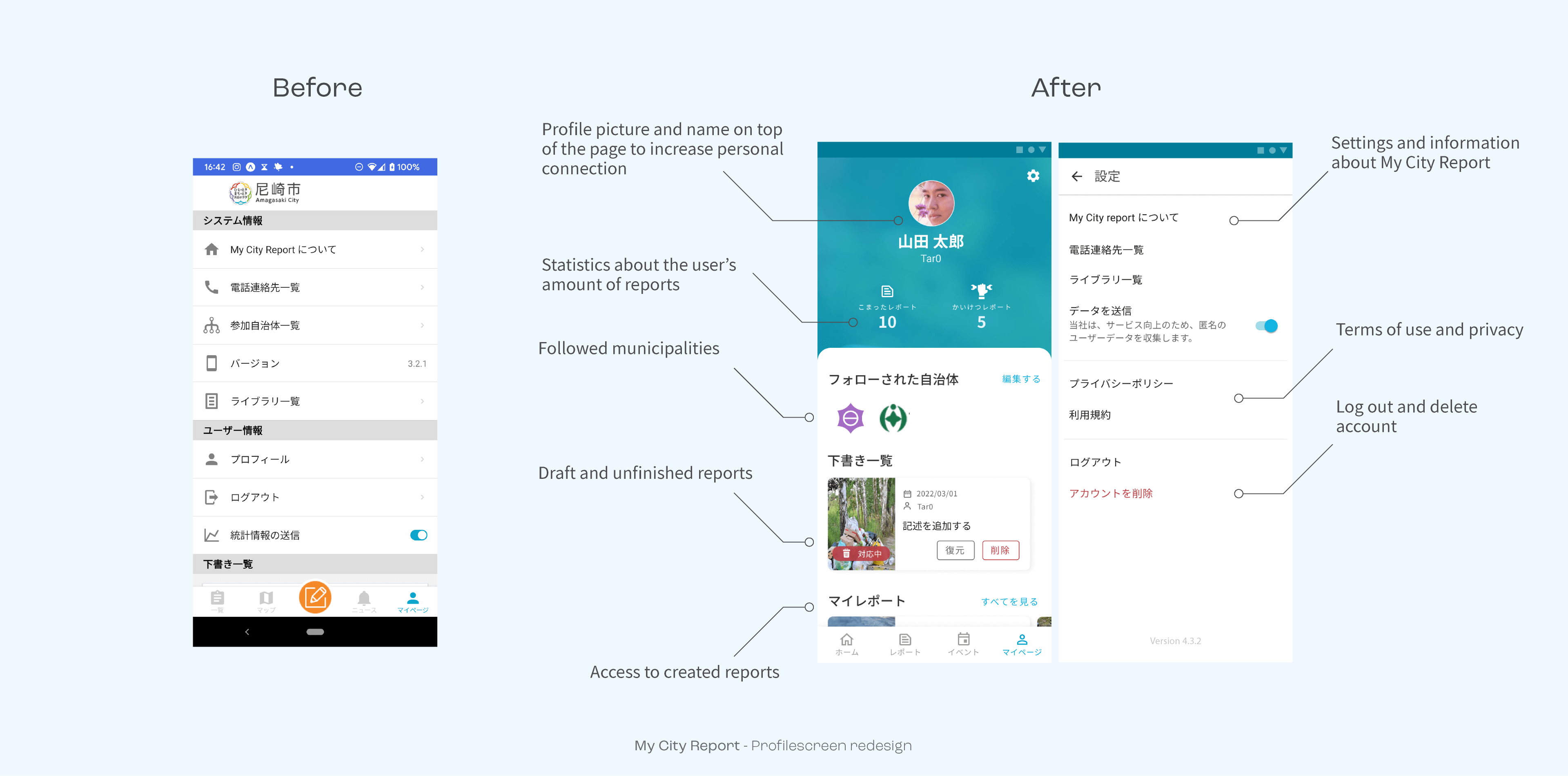
Improving the profile page
The previous profile page was a wild mix of account settings, general settings, and general information in no particular order. For the redesign, it was important to separate and structure those things. To further motivate the users, the new profile page contains statistics about their contribution to solving issues.
Reflection and outcome
The redesign of the key features resulted in a 25% increase in user engagement over the previous versions in most municipalities. Due to the involvement of various stakeholders and the change-aversive nature of Japanese governments, it was not always possible to implement all the features we envisioned. However, because of these positive outcomes, the company was able to expand the project from 10 to over 50 municipalities in Japan within one year.
The app is only available in certain regions which remains an issue and led to some frustration when users found out their particular area is not covered. Also, the platform may not guarantee a response from local authorities or a resolution to the reported problems, which could result in frustration among users as well.